Regarding Microsoft Sans
Both a critique of and tribute to the Microsoft Sans typeface; one of Helvetica’s many bastard children.
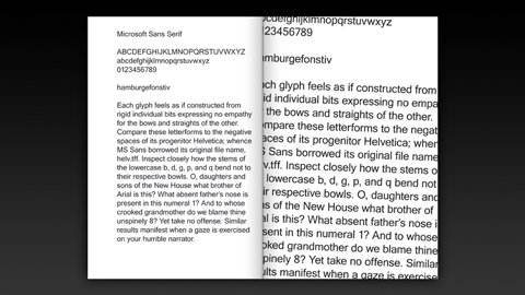
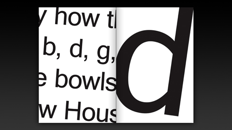
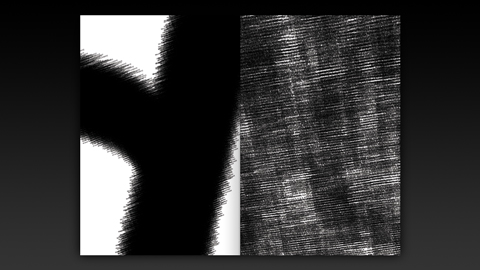
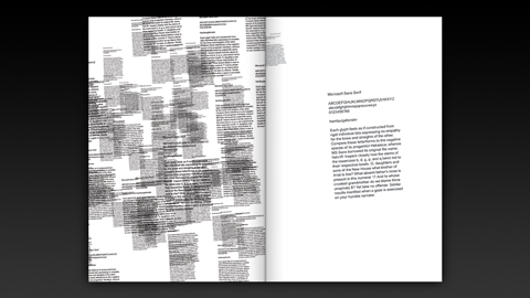
Stewdio was invited to participate alongside other design studios in a book project devoted to Microsoft’s MS Sans typeface by creating a series of spreads adhering to the constraints of using only the font itself and only black ink. Stewdio’s submission features a short text cheekily describing the demeanor of MS Sans. This paragraph is then zoomed in on upon until the characters break apart revealing each glyph to be composed of smaller versions of the paragraph—an MS Sans fractal. We created this eight frame animation loop using Ruby-Processing and, of course, MS Sans.
Released May 2010.